Day 4: Visualization
Jerry Davison and Martin Morgan
____________________________________________________________________________________________
Contents
_______________________________________________________________________________________________
1 Data Input and Manipulation (recap)
A brief review of day 1 material.
_______________________________________________________________________________________________
2 Graphics in R
R provides a number of ways to visualize data. Data visualization can be an important part of any analysis. It also provides an
opportunity to use our data manipulation skills.
The data is from the Center for Disease Control’s Behavioral Risk Factor Surveillance System (BRFSS) annual survey. Check
out the web page for a little more information. We are using a small subset of this data, including a random sample of 10000
observations from each of 1990 and 2010.
-
1.
- Input the data using read.csv, creating a variable brfss to hold it. Use file.choose(), the data file is
'BRFSS-subset.csv'.
-
2.
- Explore the data using class, dim, head, summary, etc. Use xtabs to summarize the number of males and females
in the study, in each of the two years.
-
3.
- An expression like xtabs(Weight ˜ Sex, brfss) calculates the sum of the Weight column, separately for each
Sex. Can you divide this sort of cross tabulation by the result of another xtabs function to calculate average weight
per sex in each year of the study?
-
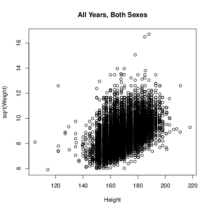
4.
- Create Figure 1 using the plot function and the main argument. Note the transformed Y-axis. Experiment with
different plotting symbols (try the command example(points).
-
5.
- In the previous plot, color the female and male points differently. To do this, use the col argument to plot. Provide as a
value to that argument a vector of colors, subset by brfss$Sex.
-
6.
- Create a subset of the data containing only observations from 2010.
> brfss2010 <- brfss[brfss$Year == "2010", ]
-
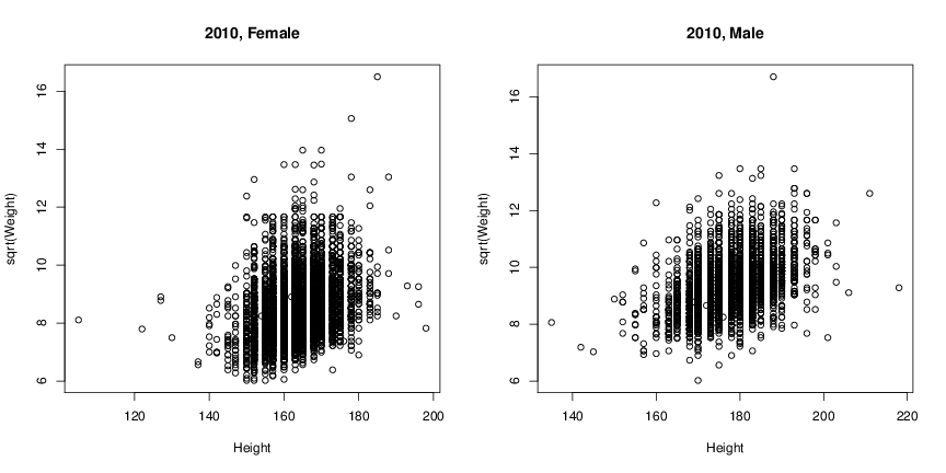
7.
- Create Figure 2 (two panels in a single figure). Do this by using the par function with the mfcol argument
before calling plot. You’ll need to create two more subsets of data, perhaps when you are providing the data to
the function plot.
-
8.
- Plotting large numbers of points means that they are often over-plotted, potentially obscuring important patterns.
Experiment with arguments to plot to address over-plotting, e.g., pch=’.’ or alpha=.4. Try using the smoothScatter
function (the data have to be presented as x and y, rather than as a formula). Try adding the hexbin library to your R
session (using library) and creating a hexbinplot.
_______________________________________________________________________________________________
3 Trellis graphics: lattice
R has a number of additional plotting facilities, both as part of the ‘base’ distribution and user-contributed packages. The
lattice package adopts a particular philosophy to the presentation of data, and can be a very effective visualization
tool.
-
1.
- Use library to load the lattice package.
-
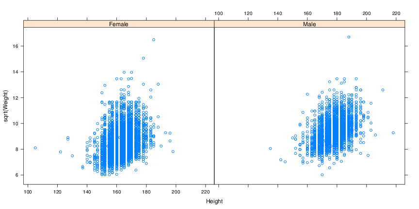
2.
- Create Figure 3 using the xyplot function with a formula and the brfss2010 data. The formula is
sqrt(Weight) ˜ Height | Sex, which can be read as ‘square root of Weight as a function of Height,
conditioned on Sex’.
-
3.
- Add a background grid and a regression line to each panel using the argument type=c(’p’, ’g’, ’r’); change the width
(lwd) and color (col.line) of the regression line.
-
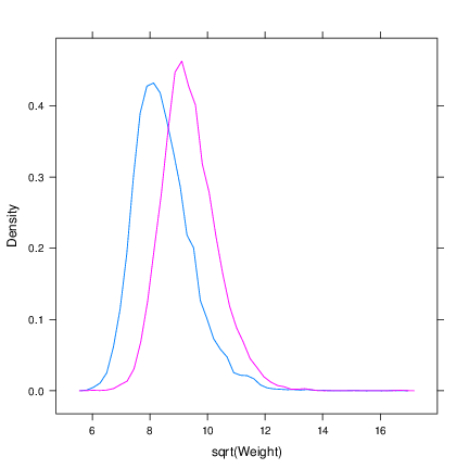
4.
- Create Figure 4. Use the densityplot function with the formula ˜ sqrt(Weight). The group=Sex function
argument creates separate lines for each sex. Be sure to use plot.points=FALSE to avoid a ‘rug’ of points at the
base of the figure. Can you add a key (legend)?
-
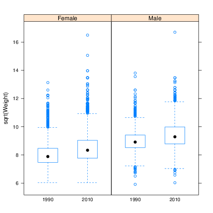
5.
- Create the left panel of Figure 5 using the bwplot. The formula requires that Year be coerced to a factor class object,
factor(Year).
-
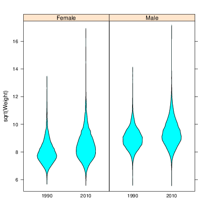
6.
- Create the right panel of Figure 5, a violin plot, using bwplot and the panel argument set to panel.violin.
panel is a function that determines how each panel is drawn.
-
7.
- (Advanced) We can write our own panel argument to lattice functions to influence how each panel is displayed. Here we
add a point at the median age and weight.
> xyplot(sqrt(Weight) ~ Height|Sex, brfss2010,
+ panel = function(x, y, ...) {
+ panel.xyplot(x, y, ...)
+ panel.points(median(x, na.rm=TRUE), median(y, na.rm=TRUE),
+ cex=2, pch=20, col="red")
+ },
+ type=c("p", "g", "r"), lwd=2, col.line="red", xlim=c(120, 210))
_______________________________________________________________________________________________
4 Other fun graphics
The grammar of graphics: ggplot2
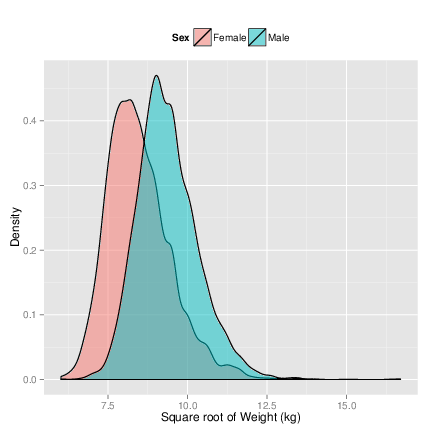
The ggplot2 user-contributed package produces very pretty looking graphics.
ggplot2 takes a different approach to constructing figures. The idea is that one starts with a plot (created by ggplot, specifying the
data source). The plot is an object. One then adds layers (e.g., geom_density(), to create a density plot) and aesthetics (e.g.,
aes(), specifying which data to plot. A basic command might look like
> ggplot(brfss2010) + geom_density() + aes(sqrt(Weight), fill=Sex)
-
1.
- Create Figure 6. You’ll want to add the alpha argument to geom_density, use the scale_x_continuous and
scale_y_continuous functions, and the theme function with argument legend.position=’top’.
Web-based graphics
Explore the googleVis package, e.g., example(gvisMotion); example(gvisGeoMap); these are used to excellent effect in
Hans Rosling’s TED presentation on poverty.
_______________________________________________________________________________________________
5 Homework!
The datasets you’ll access in this exercise are available in R for just this type of practice.
- Explore the quakes data frame. What is the range of the values in each of the columns?
- Have a look at the iris data. How many measurements are there of petal length for each species? Assume the sepals
are rectangles – what is the median sepal area of each species? Its distribution for each species?
- What’s the source of the mtcars data? The weight in nanograms of the Datsun 710? Present a table for every
letter in the alphabet, of the average mpg of the car models with that letter as the second letter in their name.
Is the mpg of models with ’o’ as the second letter significantly different from those with ’e’ as the second letter?
Interpret the result.
_______________________________________________________________________________________________
6 Resources
- Wickham, H. ggplot2: Elegant Graphics for Data Analysis. Springer New York, 2009. Web site.
- Sarkar, Deepayan. Lattice: Multivariate Data Visualization with R. Springer, New York, 2008. Web site.
- Murrell, P. R Graphics Second Edition. Chapman & Hall / CRC, Boca Raton, FL, 2011. Web site.